codeinfo.
Back to all articles
Web Design6 min read

Personal Portfolio Website with HTML and CSS

Personal Portfolio Website with HTML and CSS

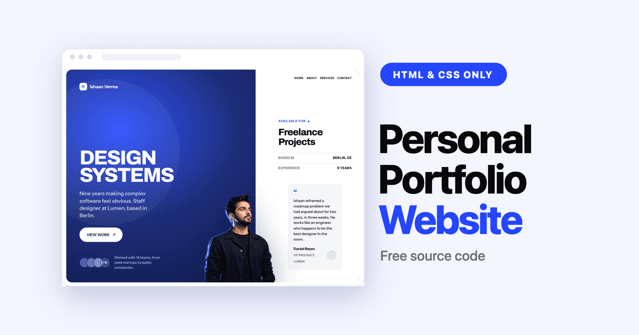
A personal portfolio website is the one project every developer and designer eventually builds, and most of them end up looking identical: a centred name, three cards, a contact form. This one is different. It uses an editorial layout with a full-bleed hero, a featured case study, and a work grid that reads like a magazine spread instead of a template.

The whole thing is HTML and CSS only. No JavaScript, no framework, no build step. Copy the two files and it runs.

<!DOCTYPE html>
<html lang="en">
<head>
<meta charset="UTF-8">
<meta name="viewport" content="width=device-width, initial-scale=1.0">
<title>Personal Portfolio Website | Code Info</title>
<link rel="preconnect" href="https://fonts.googleapis.com">
<link rel="preconnect" href="https://fonts.gstatic.com" crossorigin>
<link
href="https://fonts.googleapis.com/css2?family=Archivo:wght@700;800&family=Instrument+Sans:wght@400;500;600;700&display=swap"
rel="stylesheet">
<link rel="stylesheet" href="style.css">
</head>
<body>
<section class="hero-outer">
<div class="hero">
<div class="hero-blob"></div>
<div class="hero-left">
<div class="portrait" aria-hidden="true"></div>
<div class="brand"><span>IV</span><span>Ishaan Verma</span></div>
<div class="hero-main">
<h1>DESIGN<br />SYSTEMS</h1>
<p class="hero-sub">Nine years making complex software feel obvious. Staff designer at Lumen, based in Berlin.
</p>
<a class="btn btn-light" href="#work">VIEW WORK <span>&#8599;</span></a>
</div>
<div class="trust">
<div class="faces">
<span style="background:#4E5EA8"></span>
<span style="background:#6473BC"></span>
<span style="background:#8290CE"></span>
<span style="background:rgba(255,255,255,.18)">+12</span>
</div>
<p>Worked with 14 teams, from seed startups to public companies.</p>
</div>
</div>
<div class="hero-side">
<nav class="nav">
<a href="#work">Work</a>
<a href="#about">About</a>
<a href="#services">Services</a>
<a href="#contact">Contact</a>
<span class="menu"><i></i><i></i></span>
</nav>
<div class="avail">
<span class="eyebrow">Available for<i class="dot"></i></span>
<h2>Freelance<br />Projects</h2>
<div class="facts">
<div><span>BASED IN</span><b>BERLIN, DE</b></div>
<div><span>EXPERIENCE</span><b>9 YEARS</b></div>
</div>
</div>
<blockquote class="quote">
<div class="mark">&ldquo;</div>
<p>Ishaan reframed a roadmap problem we had argued about for two years, in three weeks. He works like an
engineer who happens to be the best designer in the room.</p>
<footer>
<div><strong>Daniel Reyes</strong><small>VP PRODUCT, LUMEN</small></div>
<i></i>
</footer>
</blockquote>
</div>
</div>
</section>
<div class="wrap">
<div class="clients">
<span class="eyebrow">Trusted by</span>
<div class="pills">
<span>Lumen</span><span>Northwind</span><span>Ardent</span><span>Kestrel</span><span>Foundry</span><span>Vantage</span>
</div>
</div>
</div>
<section id="work" class="wrap pad">
<div class="head">
<div>
<span class="eyebrow">01 / Selected work</span>
<h2 style="margin-top:14px">Selected work</h2>
</div>
<span class="note">Nine projects, 2021 to 2025</span>
</div>
<a class="feature" href="#">
<div class="shot">LUMEN INCIDENT TIMELINE</div>
<div class="feature-body">
<div>
<div class="tagrow"><span class="badge">FEATURED</span><span class="year">2025, LUMEN</span></div>
<h3>Lumen Observability</h3>
<p class="lede">On-call engineers were opening six tabs to answer one question. I rebuilt alerting and the
incident timeline around a single scannable stream, ran 40 shadowing sessions, and shipped a new charting
language with the platform team.</p>
<div class="metrics">
<div><b>&minus;38%</b><small>Median triage time</small></div>
<div><b>6 to 1</b><small>Tabs per incident</small></div>
</div>
</div>
<span class="more-link">Read case study <em>&#8594;</em></span>
</div>
</a>
<div class="grid">
<a class="card" href="#">
<div class="shot">NORTHWIND PAYOUT LEDGER</div>
<div class="card-body">
<div class="card-top">
<h3>Northwind Payouts</h3><span class="year">2024</span>
</div>
<p>Marketplace operators were reconciling payouts in spreadsheets. Built the ledger, dispute and
payout-schedule views from zero with two engineers.</p>
<div class="chips"><span>0 to 1</span><span>Fintech</span></div>
</div>
</a>
<a class="card" href="#">
<div class="shot">ARDENT DOCS AND TERMINAL</div>
<div class="card-body">
<div class="card-top">
<h3>Ardent CLI and Docs</h3><span class="year">2023</span>
</div>
<p>Rewrote the information architecture of the docs and the terminal output for a deployment tool with 12k
stars. Time to first deploy dropped from 40 minutes to 9.</p>
<div class="chips"><span>Developer tools</span><span>Information architecture</span></div>
</div>
</a>
<a class="card" href="#">
<div class="shot">GRID COMPONENT LIBRARY</div>
<div class="card-body">
<div class="card-top">
<h3>Grid Design System</h3><span class="year">2022</span>
</div>
<p>140 components and one token pipeline shared across six product surfaces, web and iOS. Ran the contribution
model and the weekly review.</p>
<div class="chips"><span>Systems</span><span>Tokens</span></div>
</div>
</a>
<a class="card" href="#">
<div class="shot">KESTREL DISPATCH MAP</div>
<div class="card-body">
<div class="card-top">
<h3>Kestrel Fleet Console</h3><span class="year">2021</span>
</div>
<p>Live monitoring for 9,000 vehicles, designed for dispatchers who work three screens and a radio at the same
time.</p>
<div class="chips"><span>Enterprise</span><span>Research</span></div>
</div>
</a>
</div>
<div class="list">
<div class="head" style="margin-bottom:20px">
<h3>More work</h3>
<span class="note">Shorter engagements and things I made on weekends</span>
</div>
<a class="row" href="#"><span class="n">06</span><span class="t">Vantage billing redesign</span><span
class="d">Usage based pricing</span><span class="y">2024</span></a>
<a class="row" href="#"><span class="n">07</span><span class="t">Foundry onboarding</span><span
class="d">Activation, 6 weeks</span><span class="y">2023</span></a>
<a class="row" href="#"><span class="n">08</span><span class="t">Plotwell charting kit</span><span class="d">Open
source, 2.4k stars</span><span class="y">2022</span></a>
<a class="row" href="#"><span class="n">09</span><span class="t">Ardent brand refresh</span><span
class="d">Identity and marketing site</span><span class="y">2021</span></a>
</div>
</section>
<section id="services" class="wrap pad">
<div class="services">
<div class="head">
<h2>How I can help</h2>
<span class="eyebrow">Services</span>
</div>
<div class="svc">
<article>
<header><span class="num">01</span><span class="arrow">&#8599;</span></header>
<div>
<h3>Product design, end to end</h3>
<p>I join your standups, open pull requests, and stay until the thing ships.</p>
</div>
</article>
<article>
<header><span class="num">02</span><span class="arrow">&#8599;</span></header>
<div>
<h3>Design system builds</h3>
<p>Tokens, components and the governance that keeps them from rotting in six months.</p>
</div>
</article>
<article>
<header><span class="num">03</span><span class="arrow">&#8599;</span></header>
<div>
<h3>Data heavy interfaces</h3>
<p>Dashboards and consoles for operators who stare at the same screen eight hours a day.</p>
</div>
</article>
</div>
</div>
</section>
<section id="about" class="wrap">
<div class="about">
<div>
<span class="eyebrow">02 / About</span>
<h2 style="margin-top:14px">The<br />short<br />version</h2>
</div>
<div>
<p class="lead">Nine years designing software where the hard part is the data model, not the surface. I
prototype in React, sit in the engineering channel, and treat a design system as production infrastructure
rather than a library of screens.</p>
<p class="body">Before Lumen I led design at Northwind and spent four years at Ardent on developer tooling. I
have hired and managed small teams, but I still spend most of my week in the file. Outside work I restore film
cameras and lose at chess online.</p>
<div class="stats">
<div><b>9</b><small>Years designing</small></div>
<div><b>31</b><small>Products shipped</small></div>
<div><b>4</b><small>Design systems built</small></div>
<div><b>2M+</b><small>Daily users reached</small></div>
</div>
<div class="cols">
<div>
<h4>Practice</h4>
<ul>
<li>Product design</li>
<li>Design systems</li>
<li>Interaction and prototyping</li>
<li>Data visualisation</li>
</ul>
</div>
<div>
<h4>Tools</h4>
<ul>
<li>Figma</li>
<li>React and TypeScript</li>
<li>Framer</li>
<li>Storybook</li>
</ul>
</div>
<div>
<h4>Recognition</h4>
<ul>
<li>Fast Company IxD finalist, 2024</li>
<li>Config speaker, 2023</li>
<li>Webby honoree, 2021</li>
</ul>
</div>
</div>
</div>
</div>
</section>
<section id="contact" class="contact-outer">
<div class="contact">
<div class="contact-blob"></div>
<div class="contact-in">
<div>
<span class="eyebrow"><i></i>03 / Contact</span>
<h2>Let's build something good.</h2>
<p>I am taking one project for Q4. Best fit: a team with a hard data problem and engineers ready to build. Two
week audits also welcome.</p>
</div>
<div class="actions">
<a class="btn btn-light" href="mailto:ishaan@verma.design">ishaan@verma.design</a>
<a class="btn btn-ghost" href="#">R&eacute;sum&eacute;</a>
</div>
</div>
<div class="foot">
<span>&copy; 2026 ISHAAN VERMA</span>
<nav><a href="#">LINKEDIN</a><a href="#">GITHUB</a><a href="#">READ.CV</a></nav>
</div>
</div>
</section>
</body>
</html>

What you will build

By the end you will have a complete responsive portfolio page with:

  • An editorial hero with a headline that scales continuously, no breakpoints
  • A featured case study panel with real outcome metrics
  • A 2x2 work grid with lift-on-hover cards
  • A numbered list for smaller projects
  • About and contact sections
  • Full responsive behaviour down to 360px

Everything below runs on two files: one HTML document and one stylesheet.

What is a portfolio website

A portfolio website is a single page that shows who you are, what you have built, and how to reach you. For developers and designers it does the job a CV cannot: it demonstrates the skill rather than describing it.

The sections that actually earn their place:

  • A hero that states your discipline, not a greeting
  • One featured project given real space, with outcomes
  • A work grid for everything else, scannable in seconds
  • A compact list for smaller engagements
  • An about section with a point of view
  • A contact block that says what you are available for

Step 1: Set up the design tokens

Everything on the page pulls from a small set of custom properties. Define them first and you can restyle the entire site by editing eight lines.

css
:root{
--ink:#0A0A0B; --body:#3F4249; --muted:#6B6F76; --line:#E4E6EA;
--paper:#FFFFFF; --tint:#F3F5FF; --grey:#F4F5F7;
--blue:#2647FF; --navy:#16205A; --violet:#6C4CF1;
--cyan:#0FB5E0; --mint:#12C29A;
--pad:20px; --gutter:40px; --maxw:1240px;
}

Two typefaces do the work. Archivo at weight 800 for headings, because it holds up at very large sizes with tight tracking, and Instrument Sans for everything else.

css
h1,h2,h3{
font-family:'Archivo',sans-serif;
font-weight:800;
letter-spacing:-.04em;
line-height:1;
}

That letter-spacing:-.04em does more than it looks. Large display type at default tracking always reads loose, and tightening it is most of what separates a considered heading from a default one. The same trick carries the Neo Brutalism website layout, which leans even harder on oversized type.

Step 2: Build the hero
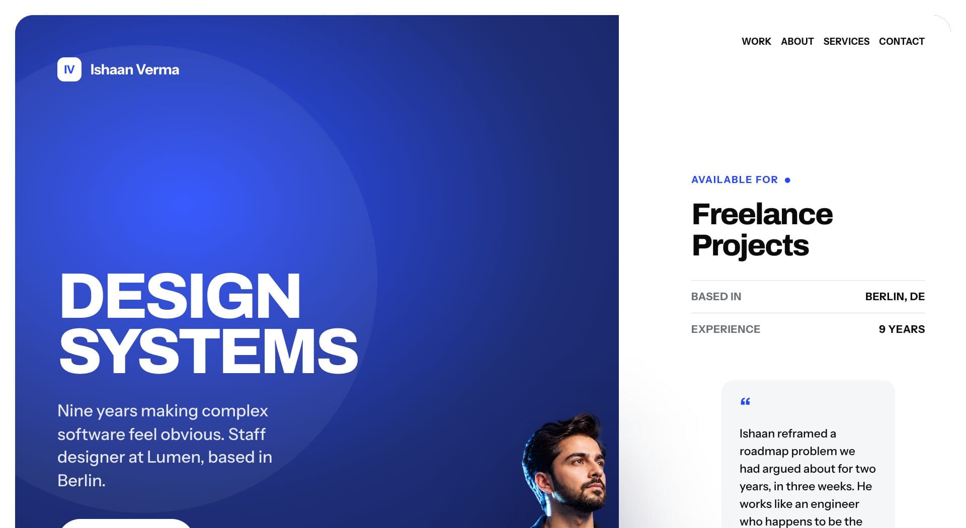
Portfolio hero section with oversized headline and portrait

The hero is a rounded dark panel inset from the viewport edge rather than a full-bleed band. That inset is what makes the page feel designed instead of generic.

css
.hero-outer{padding:var(--pad)}
.hero{
position:relative;
display:grid;
grid-template-columns:minmax(0,1fr) minmax(300px,420px);
border-radius:28px;
overflow:hidden;
container-type:inline-size;
}

The headline uses clamp() so it scales with the viewport without a single media query:

css
.hero h1{
font-size:clamp(64px,11cqw,168px);
line-height:.86;
letter-spacing:-.05em;
}

Note the cqw unit. Because the hero declares container-type:inline-size, the heading scales against the panel's width, not the viewport's. So the type stays correct even if you later drop the hero into a narrower column.

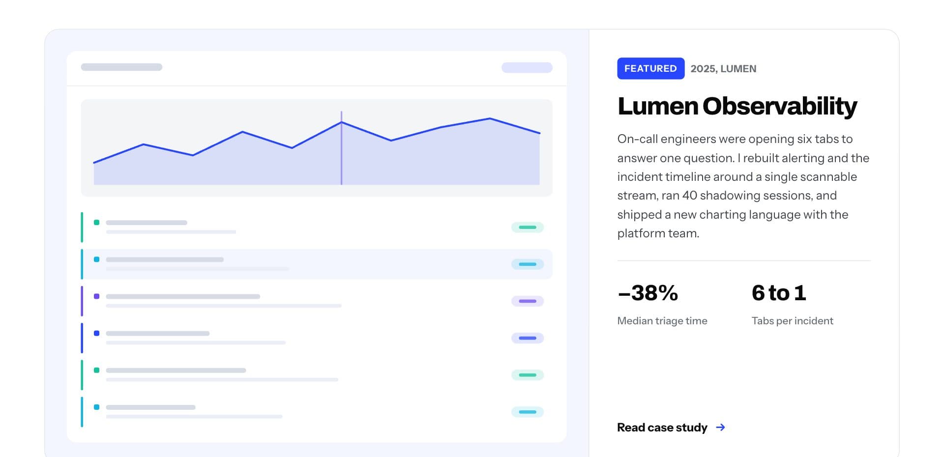
Featured case study panel with metrics and a project screenshot

The featured project is a two-column grid: image on the left, content on the right, with the body column capped so the text never runs too wide to read.

css
.feature{
display:grid;
grid-template-columns:minmax(0,1fr) minmax(300px,420px);
border:1px solid var(--line);
border-radius:20px;
overflow:hidden;
}

minmax(0,1fr) on the first column matters. A plain 1fr refuses to shrink below its content's intrinsic width, which is exactly what causes grid children to overflow their container. Setting the minimum to 0 lets it actually compress.

The two metrics underneath (-38% and 6 to 1) do more work than a paragraph would. Concrete outcomes are what separate a case study from a screenshot.

Step 4: Build the work grid
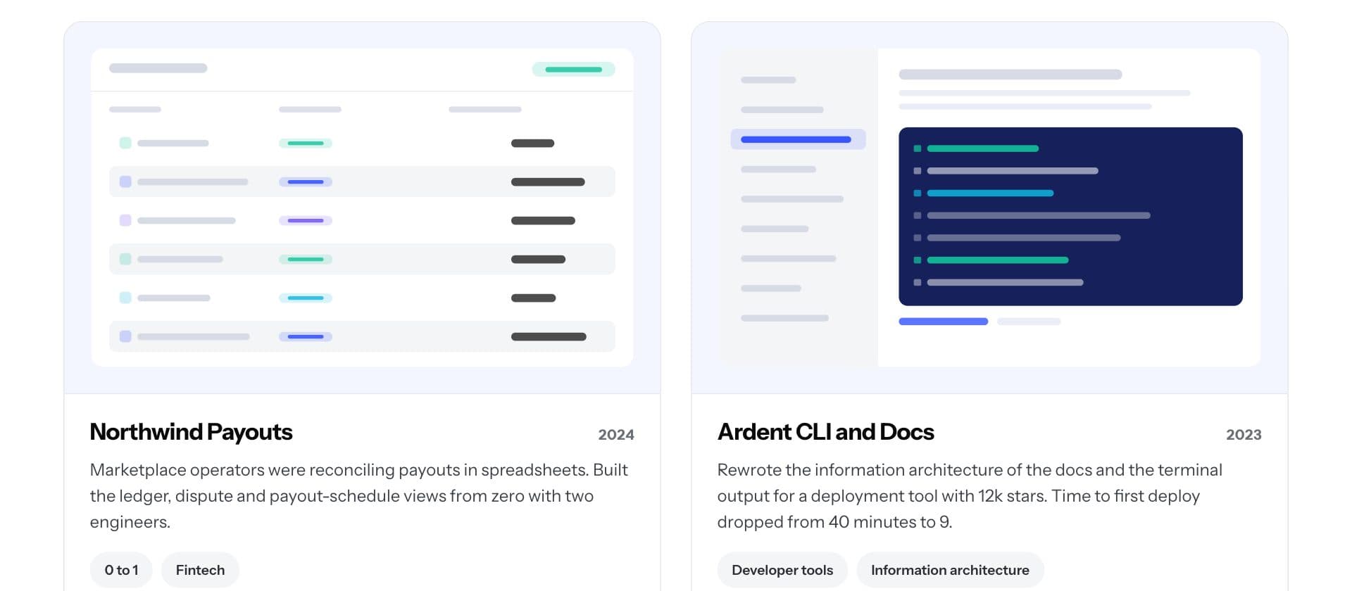
Work grid with four project cards in two columns

Four cards in a two-column grid, each one a single anchor so the whole card is clickable:

css
.grid{display:grid;grid-template-columns:repeat(2,minmax(0,1fr));gap:28px}
.card{
border:1px solid var(--line);
border-radius:18px;
overflow:hidden;
display:block;
transition:border-color .18s ease,box-shadow .18s ease,transform .18s ease;
}
.card:hover{
border-color:var(--ink);
box-shadow:0 18px 40px -30px rgba(10,10,11,.45);
transform:translateY(-3px);
}

The hover state moves three properties at once: the border darkens, a soft shadow appears, and the card lifts 3px. That negative spread on the shadow (-30px) keeps it tight under the card instead of bleeding into a grey halo. If you want a bolder take on card hovers, the responsive cards tutorial covers the same pattern with a stronger lift.

Step 5: Make it responsive

The whole page needs two breakpoints. At 980px the grids collapse to one column:

css
@media (max-width:980px){
.hero{grid-template-columns:1fr}
.feature{grid-template-columns:1fr}
.grid{grid-template-columns:1fr}
}

And at 620px the padding and type scale down. Because the hero heading already uses clamp() with a container query unit, it needs no adjustment at all — it has been resizing continuously the whole way down.

Two breakpoints is unusually few. Most layouts need more because they pin widths in pixels; this one uses minmax() and clamp() so the layout absorbs most of the range on its own. The responsive website layout guide works through that approach in more depth.

Design details worth copying

The inset panel. Wrapping the hero in padding:var(--pad) and rounding the corners is a small move with a large effect. It signals a designed page immediately.

One accent, used sparingly. The blue appears in the eyebrow labels, the featured badge and link hovers. The other four colours only ever appear inside project mockups. A single accent applied with restraint reads more expensive than five applied evenly.

Numbered structure. Section eyebrows read 01 / SELECTED WORK, and the smaller projects list is numbered 06 to 09, continuing from the four cards above. The numbering encodes something true about the content rather than decorating it.

Generous line height on body copy, tight on headings. Body text sits at 1.6, headings at 1. That contrast is what makes a page feel edited.

Where to go next

Once this is running, the natural additions are a collapsible sidebar if you expand into a multi-page site, or a bento grid section to show more projects in less vertical space.

If you want to see the same editorial approach applied to a full marketing site rather than a portfolio, building a responsive website with HTML and CSS covers that layout end to end.

Frequently Asked Questions

Do I need JavaScript for this portfolio website?

No. Everything here is HTML and CSS, including the hover states and the responsive behaviour. You would only add JavaScript for a mobile menu toggle, a theme switch, or a working contact form.

How do I add my own project images?

Each card has a .shot container. Replace its contents with an <img> and add object-fit:cover so your screenshot fills the frame at any aspect ratio:

css
.shot{overflow:hidden}
.shot img{width:100%;height:100%;object-fit:cover;display:block}

What is cqw and do I need it?

cqw is a container query unit: 1cqw is 1% of the nearest container's width, and it needs container-type:inline-size on the parent. You do not strictly need it — vw works too — but cqw means the type scales with the panel rather than the window.

How do I change the colours?

Edit the custom properties in :root. Every colour on the page references one of them, so changing --blue restyles every accent at once.

Is this portfolio website responsive?

Yes. It collapses to a single column at 980px and tightens spacing at 620px. The hero headline scales continuously with clamp(), so there is no jump between breakpoints.

Can I use this portfolio template for free?

Yes. The complete source code is in the preview above. Copy it, change the content and colours, and use it for personal or client work.
All articles