<!DOCTYPE html>
<html lang="en">
<head>
<meta charset="UTF-8">
<meta name="viewport" content="width=device-width, initial-scale=1.0">
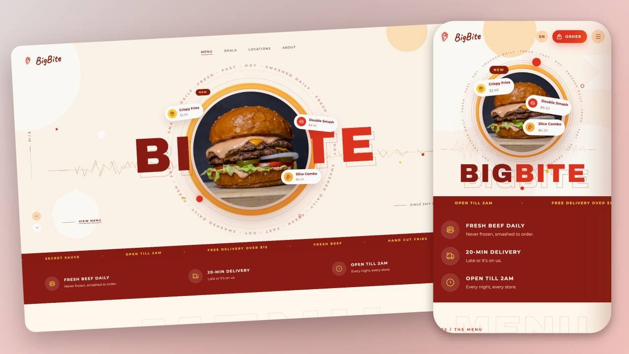
<title>BigBite Restaurant Website | Code Info</title>
<link rel="preconnect" href="https://fonts.googleapis.com">
<link rel="preconnect" href="https://fonts.gstatic.com" crossorigin>
<link
href="https://fonts.googleapis.com/css2?family=Archivo:wght@400;600;800;900&family=Montserrat:wght@400;500;600;700&family=Caveat:wght@600&display=swap"
rel="stylesheet">
<link rel="stylesheet" href="https://cdn.hugeicons.com/font/hgi-stroke-rounded.css">
<link rel="stylesheet" href="style.css">
</head>
<body>
<div class="scroll">
<div class="page">
<section class="hero" id="hero">
<div class="layer bg" data-depth="-12">
<div class="blob" style="left:-130px;top:-70px;width:420px;height:420px"></div>
<div class="blob"
style="right:250px;top:-6px;width:150px;height:150px;background:var(--sand);animation:floatY 7s ease-in-out infinite">
</div>
<div class="blob"
style="right:6px;top:136px;width:118px;height:96px;border-radius:0;clip-path:polygon(0 0,100% 0,100% 100%,0 100%,46% 50%)">
</div>
<div class="blob" style="right:-40px;bottom:-20px;width:300px;height:300px"></div>
<div class="blob" style="left:160px;bottom:130px;width:170px;height:170px"></div>
<div class="dot"
style="left:340px;top:370px;width:26px;height:26px;background:#fff;animation:floatY 5s ease-in-out infinite">
</div>
<div class="dot"
style="left:245px;top:560px;width:13px;height:13px;background:#fff;animation:floatY2 6s ease-in-out infinite">
</div>
<div class="dot" style="left:188px;top:346px;width:8px;height:8px;background:var(--red)"></div>
<div class="dot"
style="right:285px;top:508px;width:10px;height:10px;background:var(--red);animation:floatY 8s ease-in-out infinite">
</div>
<div class="dot"
style="right:245px;bottom:275px;width:22px;height:22px;background:#fff;animation:floatY2 7s ease-in-out infinite">
</div>
<div class="dot" style="right:370px;bottom:340px;width:8px;height:8px;background:var(--mustard)"></div>
</div>
<div class="layer disc" data-depth="14">
<div class="fill"></div>
<div class="ring"></div>
<div class="ring b"></div>
</div>
<div class="layer orbits" data-depth="14">
<div class="dash"></div>
<div class="o1"><span></span></div>
<div class="o2"><span class="a"></span><span class="b"></span></div>
<svg viewBox="0 0 520 520">
<defs>
<path id="ringPath" d="M260,260 m-230,0 a230,230 0 1,1 460,0 a230,230 0 1,1 -460,0" />
</defs>
<text>
<textPath href="#ringPath" textLength="1440" lengthAdjust="spacing">FRESH · FAST · HOT · SMASHED DAILY ·
FRESH · FAST · HOT · SMASHED DAILY · FRESH · FAST · HOT · SMASHED DAILY · FRESH · FAST · HOT · SMASHED
DAILY ·</textPath>
</text>
</svg>
</div>
<svg class="wave" viewBox="0 0 1360 120" preserveAspectRatio="none">
<path class="p1"
d="M60 60 L150 60 L164 44 L172 76 L182 34 L192 86 L204 52 L214 68 L226 30 L236 90 L248 46 L258 62 L272 38 L282 82 L294 56 L306 66 L318 42 L330 78 L344 50 L356 64 L370 36 L382 84 L396 54 L408 68 L422 44 L434 74 L448 58 L462 62 L476 40 L488 80 L502 52 L516 66 L530 46 L544 72 L558 56 L572 62 L586 44 L600 76 L614 54 L628 64 L642 48 L656 70 L670 58 L684 62 L698 42 L712 78 L726 52 L740 66 L754 46 L768 74 L782 56 L796 62 L810 40 L824 80 L838 54 L852 64 L866 48 L880 72 L894 58 L908 62 L922 44 L936 76 L950 52 L964 66 L978 50 L992 68 L1006 58 L1020 62 L1034 46 L1048 74 L1062 54 L1076 66 L1090 48 L1104 72 L1118 58 L1132 62 L1146 50 L1160 68 L1174 60 L1250 62"
fill="none" stroke="#d98a5a" stroke-width=".9" stroke-dasharray="60 30" />
<path
d="M120 62 L200 62 L214 74 L226 40 L240 82 L252 50 L266 68 L278 36 L292 86 L304 54 L318 64 L330 42 L344 78 L358 56 L370 66 L384 44 L398 80 L410 52 L424 68 L438 46 L450 74 L464 58 L478 62 L492 38 L506 84 L520 54 L534 66 L548 48 L562 72 L576 56 L590 62 L604 42 L618 78 L632 52 L646 66 L660 46 L674 74 L688 58 L702 62 L716 40 L730 80 L744 54 L758 64 L772 48 L786 72 L800 58 L814 62 L828 44 L842 76 L856 52 L870 66 L884 50 L898 68 L912 58 L926 62 L940 44 L954 78 L968 54 L982 66 L996 50 L1010 70 L1024 58 L1038 62 L1052 46 L1066 76 L1080 56 L1094 64 L1108 60 L1210 62"
fill="none" stroke="#e8b48e" stroke-width=".9" />
</svg>
<div class="title-ghost" aria-hidden="true">
<span>B</span><span>I</span><span>G</span><span>B</span><span>I</span><span>T</span><span>E</span></div>
<h1 class="title">
<span style="animation-delay:0s">B</span><span style="animation-delay:.07s">I</span><span
style="animation-delay:.14s">G</span><span style="animation-delay:.21s">B</span><span
style="animation-delay:.28s">I</span><span style="animation-delay:.35s">T</span><span
style="animation-delay:.42s">E</span>
</h1>
<div class="layer burger" data-depth="26" data-depth-y="20">
<div class="photo"><img src="https://images.unsplash.com/photo-1568901346375-23c9450c58cd?w=1200&q=80"
alt="Double smash burger" /></div>
<div class="badge b1"><i class="hgi hgi-stroke hgi-french-fries-02"
style="background:var(--mustard);color:var(--maroon)"></i><span><b>Crispy
Fries</b><small>$2.90</small></span></div>
<div class="badge b2"><i class="hgi hgi-stroke hgi-hamburger-02"
style="background:var(--red);color:#fff"></i><span><b>Double Smash</b><small>$8.50</small></span></div>
<div class="badge b3"><i class="hgi hgi-stroke hgi-pizza-01"
style="background:var(--orange);color:var(--maroon)"></i><span><b>Slice
Combo</b><small>$6.20</small></span></div>
<div class="new">NEW</div>
</div>
<header class="nav">
<a href="#hero" class="logo"><i class="hgi hgi-stroke hgi-french-fries-01"></i><span>BigBite</span></a>
<ul>
<li><a href="#menu" class="active">MENU</a></li>
<li><a href="#deals">DEALS</a></li>
<li><a href="#locations">LOCATIONS</a></li>
<li><a href="#app">ABOUT</a></li>
</ul>
<div class="right">
<a href="#" class="lang">EN</a>
<button type="button" class="pill order" id="cart-open" aria-label="Open cart"><i
class="hgi hgi-stroke hgi-shopping-bag-02" style="font-size:15px"></i><span>ORDER</span><span
class="count" id="cart-count">0</span></button>
<button type="button" class="burger-btn" id="nav-open" aria-label="Open menu"><i
class="hgi hgi-stroke hgi-menu-01"></i></button>
</div>
</header>
<div class="rail left">
<div class="vtext">01 / 6</div>
<div class="vline"></div>
</div>
<div class="rail social">
<a href="#"><i class="hgi hgi-stroke hgi-instagram"></i></a>
<a href="#"><i class="hgi hgi-stroke hgi-tiktok"></i></a>
<a href="#"><i class="hgi hgi-stroke hgi-youtube"></i></a>
<a href="#"><i class="hgi hgi-stroke hgi-facebook-01"></i></a>
<a href="#"><i class="hgi hgi-stroke hgi-new-twitter"></i></a>
</div>
<div class="rail delivery">
<div class="vline"></div>
<div class="vtext">DELIVERY 20 MIN</div>
<a href="#" class="icon-btn"><i class="hgi hgi-stroke hgi-delivery-truck-01" style="font-size:17px"></i></a>
</div>
<div class="arrows">
<a href="#hero" class="up"><i class="hgi hgi-stroke hgi-arrow-up-01"></i></a>
<a href="#menu" class="down"><i class="hgi hgi-stroke hgi-arrow-down-01"></i></a>
</div>
<div class="foot-link l"><a href="#menu">VIEW MENU</a></div>
<div class="foot-link r"><span>SINCE 2017 © BIGBITE</span></div>
<div class="marquee">
<div class="track">
<span><span>FRESH BEEF</span><span>·</span><span>HAND CUT FRIES</span><span>·</span><span>SECRET
SAUCE</span><span>·</span><span>OPEN TILL 2AM</span><span>·</span><span>FREE DELIVERY OVER
$15</span><span>·</span></span>
<span><span>FRESH BEEF</span><span>·</span><span>HAND CUT FRIES</span><span>·</span><span>SECRET
SAUCE</span><span>·</span><span>OPEN TILL 2AM</span><span>·</span><span>FREE DELIVERY OVER
$15</span><span>·</span></span>
</div>
</div>
<div class="grain"></div>
</section>
<section class="features">
<div class="feature reveal"><i class="hgi hgi-stroke hgi-hamburger-01"></i><span><b>FRESH BEEF
DAILY</b><small>Never frozen, smashed to order.</small></span></div>
<div class="feature reveal d1"><i class="hgi hgi-stroke hgi-delivery-truck-01"></i><span><b>20-MIN
DELIVERY</b><small>Late or it's on us.</small></span></div>
<div class="feature reveal d2"><i class="hgi hgi-stroke hgi-clock-01"></i><span><b>OPEN TILL 2AM</b><small>Every
night, every store.</small></span></div>
</section>
<section class="menu" id="menu">
<div class="ghost" aria-hidden="true">MENU</div>
<div class="sec-head reveal">
<div class="t"><span class="eyebrow">02 / THE MENU</span>
<h2 class="h2">PICK YOUR<br>POISON.</h2>
</div>
<div class="tabs"><span>BURGERS</span><a href="#">FRIES</a><a href="#">DRINKS</a></div>
</div>
<div class="grid3" id="menu-grid"></div>
</section>
<section class="deals" id="deals">
<div class="ringbg"></div>
<div class="sec-head reveal" style="margin-bottom:56px">
<div class="t"><span class="eyebrow">03 / DEALS</span>
<h2 class="h2">TODAY'S<br>COMBOS.</h2>
</div>
</div>
<div class="grid">
<article class="deal dark reveal">
<div class="photo"><img src="https://images.unsplash.com/photo-1550547660-d9450f859349?w=900&q=80"
alt="Duo combo" /></div>
<div class="body"><span class="lbl">SAVE $4.50</span>
<h3>Duo Combo</h3>
<p>Two Double Smash burgers, two large fries and two drinks. Made for sharing, rarely shared.</p>
</div>
<div class="cta"><span class="big">$14.90</span><a href="#" class="pill">ORDER <i
class="hgi hgi-stroke hgi-arrow-right-01" style="font-size:16px"></i></a></div>
</article>
<article class="deal light reveal d1">
<div class="blobr"></div>
<div class="body"><span class="lbl">AFTER 10PM</span>
<h3>Late Night Box</h3>
<p>Classic Cheese, crispy fries, four nuggets and a Cola Float. Your 1am decision, sorted.</p>
</div>
<div class="cta"><span class="big">$9.90</span><a href="#" class="pill">ORDER <i
class="hgi hgi-stroke hgi-arrow-right-01" style="font-size:16px"></i></a></div>
</article>
</div>
</section>
<section class="locations" id="locations">
<div class="sec-head reveal">
<div class="t"><span class="eyebrow">04 / LOCATIONS</span>
<h2 class="h2">FIND A<br>BIGBITE.</h2>
</div>
<p class="lead">Three kitchens, one recipe. Walk in, drive through, or let us come to you.</p>
</div>
<div class="loc-grid">
<div class="map reveal">Map goes here</div>
<div class="stores" id="stores"></div>
</div>
</section>
<section class="app" id="app">
<div class="orbit"><span></span></div>
<div class="copy reveal">
<span class="eyebrow">05 / ORDER ONLINE</span>
<h2>SKIP THE<br>LINE.</h2>
<p>Order in the app, track your driver live and unlock a free Crispy Fries on your first order.</p>
<div class="btns">
<a href="#" class="pill dark"><i class="hgi hgi-stroke hgi-smart-phone-01"></i>APP STORE</a>
<a href="#" class="pill lite"><i class="hgi hgi-stroke hgi-smart-phone-01"></i>GOOGLE PLAY</a>
</div>
<div class="call"><i class="hgi hgi-stroke hgi-call" style="font-size:16px"></i><span>Or call <b>+1 (555)
244-8283</b> for pickup</span></div>
</div>
<div class="phone reveal d1">
<div class="notch"></div>
<div class="screen">App screenshot</div>
</div>
</section>
<footer>
<div class="fgrid">
<div class="fcol" style="gap:18px">
<a href="#hero" class="logo"><i class="hgi hgi-stroke hgi-french-fries-01"></i><span>BigBite</span></a>
<p class="about">Smash burgers, hand-cut fries and secret sauce since 2017. Open till 2am, every night.</p>
<div class="fsocial">
<a href="#"><i class="hgi hgi-stroke hgi-instagram"></i></a>
<a href="#"><i class="hgi hgi-stroke hgi-tiktok"></i></a>
<a href="#"><i class="hgi hgi-stroke hgi-youtube"></i></a>
<a href="#"><i class="hgi hgi-stroke hgi-facebook-01"></i></a>
</div>
</div>
<div class="fcol"><b>MENU</b><a href="#">Burgers</a><a href="#">Fries & Sides</a><a href="#">Drinks</a><a
href="#">Combos</a></div>
<div class="fcol"><b>COMPANY</b><a href="#">Our Story</a><a href="#">Locations</a><a href="#">Careers</a><a
href="#">Franchise</a></div>
<div class="fcol"><b>HELP</b><a href="#">Track Order</a><a href="#">Allergens</a><a href="#">Contact</a><a
href="#">FAQ</a></div>
</div>
<div class="fbar"><span>© 2017–2026 BIGBITE. ALL RIGHTS RESERVED.</span>
<div><a href="#">PRIVACY</a><a href="#">TERMS</a></div>
</div>
</footer>
</div>
</div>
<div class="scrim" id="scrim"></div>
<nav class="mnav" id="mnav">
<button type="button" class="x" id="nav-close" aria-label="Close menu"><i
class="hgi hgi-stroke hgi-cancel-01"></i></button>
<a href="#menu">MENU</a>
<a href="#deals">DEALS</a>
<a href="#locations">LOCATIONS</a>
<a href="#app">ABOUT</a>
</nav>
<aside class="drawer" id="drawer" aria-label="Your order" data-step="cart">
<header>
<button type="button" class="x back" id="step-back" aria-label="Back to cart"><i
class="hgi hgi-stroke hgi-arrow-left-01"></i></button>
<div><b id="drawer-title">YOUR ORDER</b><small id="cart-sub">0 ITEMS</small></div>
<button type="button" class="x" id="cart-close" aria-label="Close cart"><i
class="hgi hgi-stroke hgi-cancel-01"></i></button>
</header>
<div class="panes">
<section class="pane" data-pane="cart">
<div class="items" id="cart-items"></div>
<div class="pfoot">
<div class="srow"><span>SUBTOTAL</span><span id="cart-subtotal">$0.00</span></div>
<div class="srow"><span>DELIVERY</span><span id="cart-delivery">FREE OVER $15</span></div>
<div class="srow total"><span>TOTAL</span><b id="cart-total">$0.00</b></div>
<button type="button" class="checkout" id="cart-checkout" disabled>CHECKOUT <i
class="hgi hgi-stroke hgi-arrow-right-01" style="font-size:16px"></i></button>
</div>
</section>
<section class="pane" data-pane="form">
<form class="fields" id="order-form" novalidate>
<label><span>FULL NAME</span><input name="name" type="text" placeholder="Alex Carter"
autocomplete="name"></label>
<label><span>PHONE</span><input name="phone" type="tel" placeholder="555 0142 88" autocomplete="tel"></label>
<label><span>DELIVERY ADDRESS</span><input name="address" type="text" placeholder="412 Market St, Apt 9"
autocomplete="street-address"></label>
<label><span>NOTE FOR THE KITCHEN</span><input name="note" type="text"
placeholder="Extra pickles, no onion"></label>
<fieldset class="pay">
<legend>PAYMENT</legend>
<label class="opt"><input type="radio" name="pay" value="cash" checked><span><i
class="hgi hgi-stroke hgi-money-01"></i>CASH</span></label>
<label class="opt"><input type="radio" name="pay" value="card"><span><i
class="hgi hgi-stroke hgi-credit-card"></i>CARD</span></label>
</fieldset>
</form>
<div class="pfoot">
<div class="srow total"><span>TOTAL</span><b id="form-total">$0.00</b></div>
<button type="button" class="checkout" id="place-order">ORDER NOW <i
class="hgi hgi-stroke hgi-delivery-truck-01" style="font-size:17px"></i></button>
</div>
</section>
<section class="pane done" data-pane="done">
<div class="tickwrap">
<div class="burst-ring"><span></span><span></span><span></span></div>
<svg class="tick" viewBox="0 0 52 52" aria-hidden="true">
<circle class="tick-c" cx="26" cy="26" r="23" />
<path class="tick-p" d="M15 26.5 L22.5 34 L37.5 19" />
</svg>
</div>
<b>ORDER PLACED</b>
<p>Your food is being smashed right now. We will text you when the driver leaves.</p>
<div class="receipt">
<div><small>ORDER</small><b id="ord-no">#BB-0000</b></div>
<div><small>ARRIVES IN</small><b id="ord-eta">20 MIN</b></div>
<div><small>PAID</small><b id="ord-total">$0.00</b></div>
</div>
<button type="button" class="checkout ghostbtn" id="order-done">BACK TO MENU</button>
</section>
</div>
</aside>
<script src="script.js"></script>
</body>
</html>